Microcopy, instructional copy, and labels. Little bits of information are making or breaking the user experience of your website or application. Microcopy is there to explain what a setting does, aid users filling out a form, and explain complex interactions. Well-written microcopy guides users, and poorly written microcopy confuses and frustrates them.
Microcopy can be the achilles heel of an otherwise excellent design.
Here are 9 ways that you could be failing your users with thoughtless microcopy:
You’re too verbose
Verbose instructions are more difficult to understand than concise instructions. Remember, there is a reason it’s called microcopy. Users don’t want to read long instructions on how to complete a single task.

You’re not testing copy
I recently completed a project where I did user testing for a web app. During testing I found that most of the usability problems were due to the copy.
In one instance, 3/5 of the users interpreted one line of copy in a way that wasn’t its intended purpose. This line was asking users to make a decision, so they were making decisions based on bad copy.
You can gain insight into how people are interpreting the copy by testing on actual users. Encourage users to think out loud as they complete tasks and you’ll learn a lot about your copy from what they say. Revise your copy based on insights gained in testing, then continue to test and revise.
Your labels look like they’re written for a machine, not a person
Be sure to write labels for people. Labels should be in plain language and not technical jargon.
Sometimes, there is a tendency to let the programmer label things as they build the site. If they’re focused on the technical implementation, the labels could end up looking like database architecture. This is why labels should be specced out before the programmer starts to build, or at least along side each other. The labels should define the database architecture and not the other way around.
Your button labels don’t spell out what action the button takes
Button labels should be the action the user will take by clicking on it.
Buttons that say “OK”, “Next”, and “Submit” are not clear and will cause doubt to creep into the user’s mind.
Buttons that say “Save Settings”, “Place My Order”, and “Login” do a better job of conveying the action the user will take by clicking on the button.
You’re not anticipating user’s questions
A great example of anticipating user’s questions is on e-commerce sites:
- “Your card will not be charged yet.”
- “You can cancel anytime.”
- “Free returns on every order.”
These are answers to common questions that shoppers have shopping online.
User testing is a great way to find out what kind of questions users are asking. I recently did a testing session with a user that was adjusting settings. There was a checkbox that had copy explaining what the box did when checked. But as the user thought out loud, she asked what would happen if she didn’t check the box, which was a great question I didn’t think of on my own.
You’re keyword stuffing for SEO
Search engine optimization (SEO) is critical to designing websites. It can be tempting to try to insert keywords anywhere possible, but be careful not to sacrifice clarity for SEO.
Content should be written for people, not search engines, or you run the risk of over optimizing. Inserting keywords everywhere isn’t natural and leads to difficult to understand copy, even most SEO professionals in 2015 would agree with that.
The good news is that it’s not an either-or proposition, you can make well-written content that ranks high in search engines.
You’re showing users more than they need at that moment
A common mistake is to show the user everything at once and write a lot of “If” statements in the copy. A better way is progressive disclosure.
If you show unnecessary information all at once, you will clutter your UI and strain your users’ cognitive load with unnecessary information.
Instead of showing every field and message at once, show them only when the user enters a state where it becomes necessary.
A classic example is the “Other” field on forms. The Other field is usually paired with something like a “How did you hear about us?” select box field. It’s not necessary to show the Other field unless the user selects “other” in the select box.
You’re not paying attention to error messages
Error handling is usually one of the finishing touches on a project—if it gets any attention at all. Sadly, there is a lot of poor error handling out there.
How many times have you run into an error message that spits out technical jargon? Or quirky unhelpful 404 pages? Or times where you knew there was an error but you’re not sure how you got there?
The first step is to prevent errors wherever possible. Errors shouldn’t occur because of a problem with the design or architecture. Then, when you have figured out all the possible errors, make sure to write error messages that tell the user how to recover.
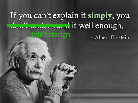
You rely on copy when the design should be self explanatory
I did support for hundreds of websites in the beginning of my career. One of the things I learned was when a client contacted me to say something was hard to use, usually the wrong thing to do was to add instructions to the UI. This can be a sign that something is wrong with the design, and a bad design with instructions is no better off.
Stop and think if there is a way to make the design speak for itself if you’re writing a lot of instructional copy on a UI.
Microcopy: Not An Afterthought
Keep these 9 principles in mind as you design. It can help save everything from small marketing websites to highly interactive web apps.
If you have more to add, please let me know!